INDUSTRY
Industrial Instrumentation
DELIVERABLES
Positioning, Messaging Framework, Brand Guidelines, Brand Book, Resource Center, Collateral templates, Website home page, Social templates, Experiential Branding
Company overview
Ashcroft, a global leader in pressure and temperature measurement solutions, set out to refine its brand positioning and strategy. With a legacy of precision and innovation, the company aimed to align its brand with their strategic goals while balancing global consistency with regional market needs.
Project overview
Ashcroft had built its reputation on precision, reliability and trust. But as the business continued to grow across regions, product lines, and audiences, the brand itself struggled to operate with the same clarity.
The challenge was not awareness or performance. It was alignment.
Ashcroft partnered with McL to evolve its brand from a collection of well-executed touchpoints into a unified global system—one that could guide decisions, scale across regions, and support long-term growth without losing the integrity of the brand’s legacy.
The goal was simple but ambitious: create a brand foundation strong enough to align leadership, empower teams, and show up consistently across digital, physical, and experiential environments—while allowing for regional flexibility where it mattered.
The challenge
Like many global manufacturing organizations, Ashcroft faced increasing complexity through mergers and growth:
A growing portfolio of products and audiences
Regional teams operating with different priorities
Brand and marketing assets developed over time without a shared strategic anchor
Inconsistent storytelling across digital, sales and internal communications
The result was friction. Teams were working hard, but decisions took longer than they should. Messaging varied by market. Visual identity stretched to accommodate competing interpretations. The brand no longer reflected the precision and confidence of the business itself.
This was not a design problem. It was a clarity problem.
Phase 1:
-
To gain clarity, McL led a structured, phased brand strategy initiative to create alignment before execution. The work began with a global assessment of how the brand was understood, used and experienced.
One-on-one interviews and a global workshop with leadership, brand ambassadors and power users uncovered fresh insights
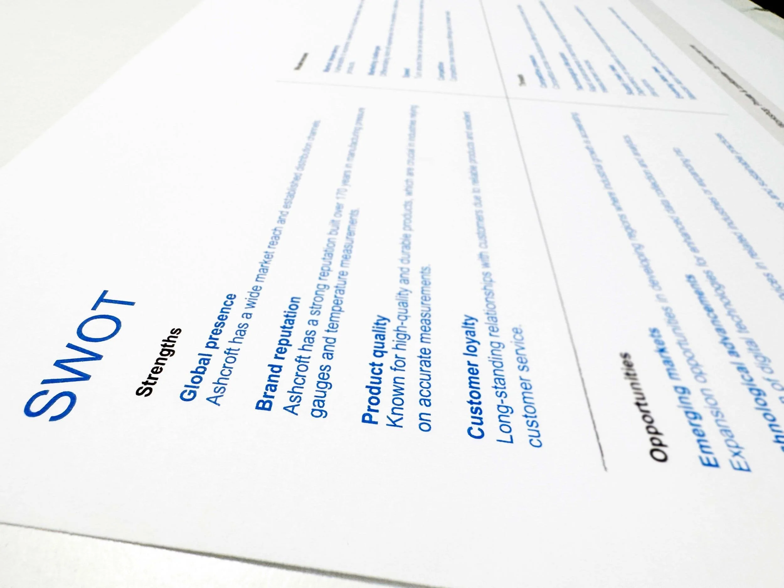
A comprehensive SWOT and competitive analysis led us to our next steps
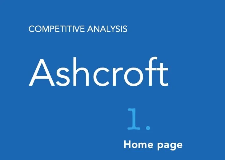
Auditing the existing brand, marketing and digital assets opened areas for improvement
Identification of proof points to support meaningful differentiation began to boil up
This phase revealed a critical insight: teams shared pride in the brand but lacked a common language to express it. Without that shared understanding, consistency was impossible to sustain.
Phase 2:
-
With clarity established, the focus shifted to defining the brand at its core.
A refined Ashcroft BrandScript to articulate who the brand is, what it stands for and why it matters
Defined vision, mission and values to anchor decision-making
Developed a unified messaging framework with key messages, tone of voice, proof points and an elevator pitch
This work gave the organization a clear strategic lens—one that reduced debate, improved alignment and allowed teams to move faster with confidence.
Phase 3:
-
Strategy became operational through tools designed for real-world use, such as:
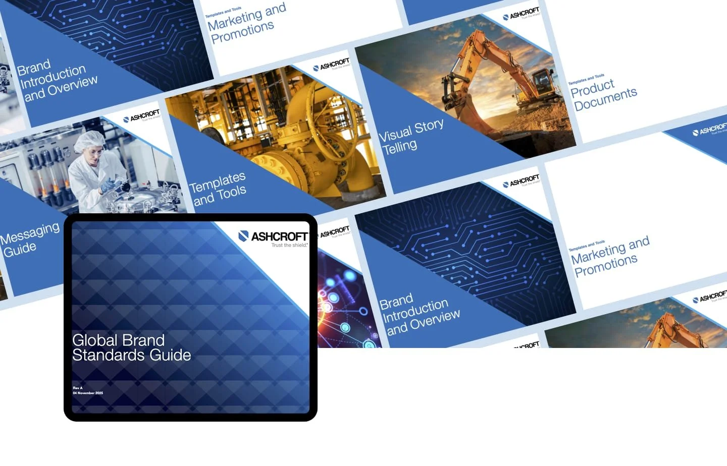
Creation of a comprehensive Brand Book and Brand Standards Guide
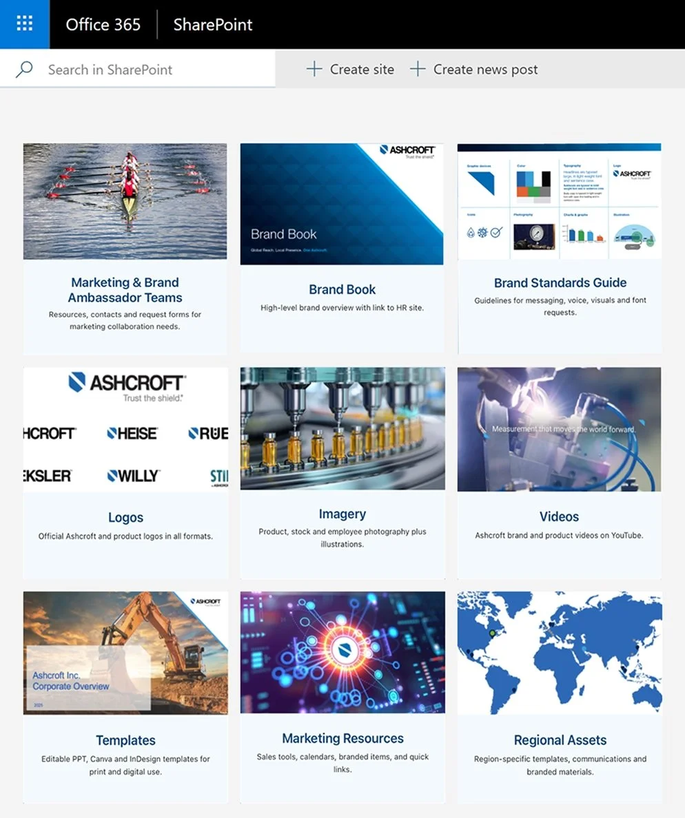
Launch of a Global Resource Center to centralize assets, templates and guidance
Development of refreshed templates to support day-to-day communications
Production of a global brand video to bring the brand to life
The focus was adoption, not enforcement. The system was designed to be practical, flexible and easy to use, so consistency became a natural outcome, not a policing exercise.
Phase 4:
Experiential and environmental expression
To ensure the brand lived beyond screens and documents, the work extended into physical spaces:
A large-scale experiential mural in the lead sales office, reinforcing purpose and values
Updated environmental graphics at the Querétaro, Mexico manufacturing facility
Branded environments designed to build pride, reinforce clarity and connect employees to the broader brand story
These moments translated strategy into experience, making the brand visible, human and tangible.
Impact
Ashcroft now operates with a brand system that reflects the discipline of its business.
Clear alignment across global teams and regions
Stronger consistency across digital, physical and experiential touchpoints
Faster decision-making supported by a scalable foundation that supports growth without constant reinvention
The brand is no longer something teams reference at the end of a project. It is a strategic asset that guides how the organization communicates, behaves and evolves.