Translating strategy into a cohesive visual identity
The Challenge
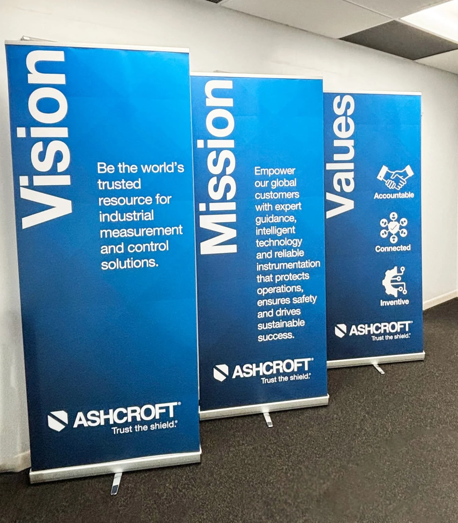
Following a comprehensive brand strategy and messaging initiative, Ashcroft needed a visual identity that could do three things at once: honor its legacy, support a modern and inventive brand position, and scale consistently across regions, teams, and applications.
The Approach
We translated Ashcroft’s clarified purpose, values and voice into a disciplined, yet flexible visual system built for global use. The work focused on turning strategy into practical, usable design tools rather than decorative assets.
Key elements included:
A refined product logo system centered on the shield as a symbol of trust and protection
A simplified, ownable color palette led by Shield Blue with clear guidance for digital and print use
Clear typography standards that balance technical precision with approachability
Distinctive graphic devices and angles derived from the shield to create a recognizable visual language
Photography, iconography, charts and illustrations designed to be user friendly and authentic
Custom pattern derived from the angles of the shield setting Ashcroft apart from its competition
The Outcome
The result is a cohesive visual identity that brings the Ashcroft brand to life with clarity and confidence. The system is intuitive for internal teams, scalable across global markets and strong enough to unify everything from a brand video and marketing materials to product documentation and internal communications.
By tightly aligning visual expression with brand strategy and messaging, Ashcroft now shows up consistently as one brand, everywhere it operates.
–––––––––––––––
Credits
Jennifer Hoynes, Catherine Futoma, Roberta Reynolds, Tony Pratt, Eileen Riestra, Eileen Tellis, Kevin Kearns, Robin McLoughlin